Thank you for purchasing Hebes template. This documentation will help to know more about template and how is structured and how to use the template features.
Hebes is a template for multi purpose sites built on Bootstrap Framework, AIDA marketing model and Principles of Conversion Centered Design, You can start to use template.html where all main files are already included and ready to use.
Requirements
To be able to use HTML template, you must have the following:
- PHP (for contact page)
- Apache webserver (Windows servers will probably work, but are not supported)
- An FTP tool to upload the files
- Make sure you upload the required assets files/folders listed below:
HTML/assets/css- Extra Stylesheets FolderHTML/assets/include- Required PHP Functions FolderHTML/assets/images- Images FolderHTML/assets/js- Javacripts FolderHTML/assets/revolution- revolution slider FolderHTML/assets/css/style.css- Main Stylesheet FileHTML/index.html- Index File/Homepage
Installation
Follow the steps below to get started with your Hebes Template:
- Open the
Package/HTMLFolder to find all the html Templates Files - You will need to Upload these files to localhost server or your Web Server using FTP in order to use it on your Website.
- Make sure you upload the required files/folders listed below:
HTML/assets- Required all file Folder.- Select
HTML/home-1.htmlwhich want to use. - change
HTML/index.htmlname file toHTML/index.html- Index File
File Structure
unzip the compressed archive to see the following structure:
 Hebes/
  ├── Documentation/
  ├── HTML/
      ├── assets/
          ├── css
          ├── icons
          ├── images
          ├── fonts
          ├── js
          ├── scss
          ├── revolution
          └── php
      ├── index(intro)
      ├── home-1.html
      ├── ...
      └── page-cotact-1.html
Html Structure
we use the bootstrap framework as a framework. You can take a look at bootstrap here and see it's feature in action.
And basic layout of the grids look like:
<div class="row">
  <div class="col-md-9">
    Level 1: .col-md-9
    <div class="row">
      <div class="col-sm-8 col-md-6">
        Level 2: .col-sm-8 .col-md-6
      </div>
      <div class="col-sm-4 col-md-6">
        Level 2: .col-sm-4 .col-md-6
      </div>
    </div>
  </div>
</div>
If you find that you need to change structure. Scroll down in your html file and find section that you want to change , all section have predefined html comments like below section example.
CSS Structure
Here's a list of the stylesheet files I'm using with this template, you can find more information opening each file:
| File Name | Description |
|---|---|
bootstrap.min.css |
This are generic styles, resets & normalization.you can take a look here add see it's feature in action. |
external.css |
This is a bunch of cool, fun, and minify for all external css resources you can found this resources in css folder. |
style.css |
This is the main css file, it contains all the styles of the website. |
custom.css |
To Be Safe, We recommend you writing your rules and style declarations here and just override the previous rules. So in case i make an update you can just replace the stylesheet. |
Javascript Structure
The js (scripts) files are loaded in footer. I loaded js Library in the bottom because it will increase the site speed and rendering.
The JS files used in this template are:
| File | Description |
|---|---|
jquery-3.3.1.min.js |
jQuery is a Javascript library that greatly reduces the aHebes of code that you must write. |
bootstrap.min.js |
this bring Bootstrap's components to life with over a dozen custom jQuery plugins. Easily include them all, or one by one. |
plugins.js |
this bring all javascript plugins to life which we compresed all plugins to min. |
functions.js |
this to active javascript function and add some coll function to your landing page. |
jquery.validate.min |
AjaxChimp is a jQuery plugin that lets you validate your mailchimp form. |
owl.carousel.min.js |
jQuery plugin that lets you create beautiful responsive carousel slider. |
html5shiv.js |
This script is the defacto way to enable use of HTML5 sectioning elements in legacy Internet Explorer. |
respond.min.js |
this script is to provide a fast and lightweight (3kb minified / 1kb gzipped) script to enable responsive web designs in browsers that don't support CSS3 Media Queries. |
Loading Screen
You can use loading screen spinners.
Here's a loading screen I'm using with this template, you can select/change what you need and use it:
<div class="preloader">
	<div class="loader-eclipse">
		<div class="loader-content"></div>
	</div>
</div>
Change Fonts
To change the font, Check head inindex.html then in first go to google fonts choose a font and use the generated code and replace with next code.
<!-- Fonts
============================================= -->

<link href="https://fonts.googleapis.com/css?family=Lato:100,100i,300,300i,400,400i,700,700i,900,900i%7CMontserrat:100,100i,200,200i,300,300i,400,400i,500,500i,600,600i,700,700i,800,800i,900,900i%7CPlayfair+Display:400,400i" rel='stylesheet' type='text/css'>
Next Step : change font family for body in style.css
body {
	font-family: "Lato", sans-serif;/*Change font*/
}
h1,h2,h3,h4,h5,h6{
	font-family: "Montserrat", sans-serif;/*Change font*/
}
Change Spacing
we uses helper classes to space elements on Hebes template. Helper classes are used to space elements with margin and padding. This makes it easier to create your own elements in HTML without needing extra CSS to arrange them appropriately.
AVAILABLE CLASSES
/* All margin */

.m-0 {
    margin: 0 !important;
}

.m-xs {
    margin: ($baseline/2);
}

.m-sm {
    margin: $baseline;
}

.m-md {
    margin: $baseline*2;
}

.m-lg {
    margin: $baseline*4;
}

/*  margin top */

.mt-0 {
    margin-top: 0 !important;
}

.mt-xs {
    margin-top: ($baseline/2);
}

.mt-10 {
    margin-top: 10px !important;
}

.mt-20 {
    margin-top: 20px !important;
}

.mt-30 {
    margin-top: 30px !important;
}

.mt-40 {
    margin-top: 40px !important;
}

.mt-50 {
    margin-top: 50px !important;
}

.mt-60 {
    margin-top: 60px !important;
}

.mt-70 {
    margin-top: 70px !important;
}

.mt-80 {
    margin-top: 80px !important;
}

.mt-90 {
    margin-top: 90px !important;
}

.mt-100 {
    margin-top: 100px !important;
}

.mt-120 {
    margin-top: 120px !important;
}

.mt-150 {
    margin-top: 150px !important;
}

.mt-220 {
    margin-top: 220px !important;
}

/*  margin bottom */

.mb-0 {
    margin-bottom: 0 !important;
}

.mb-15 {
    margin-bottom: 15px;
}

.mb-10 {
    margin-bottom: 10px !important;
}

.mb-20 {
    margin-bottom: 20px !important;
}

.mb-25 {
    margin-bottom: 25px !important;
}

.mb-30 {
    margin-bottom: 30px !important;
}

.mb-35 {
    margin-bottom: 35px !important;
}

.mb-40 {
    margin-bottom: 40px !important;
}

.mb-50 {
    margin-bottom: 50px !important;
}

.mb-55 {
    margin-bottom: 55px !important;
}

.mb-60 {
    margin-bottom: 60px !important;
}

.mb-65 {
    margin-bottom: 65px !important;
}

.mb-70 {
    margin-bottom: 70px !important;
}

.mb-80 {
    margin-bottom: 80px !important;
}

.mb-90 {
    margin-bottom: 90px !important;
}

.mb-100 {
    margin-bottom: 100px !important;
}

.mb-120 {
    margin-bottom: 120px !important;
}

.mb-130 {
    margin-bottom: 130px !important;
}

.mb-140 {
    margin-bottom: 140px !important;
}

.mb-150 {
    margin-bottom: 150px !important;
}

.mb-160 {
    margin-bottom: 160px !important;
}

.mb-180 {
    margin-bottom: 180px !important;
}

.mb-220 {
    margin-bottom: 220px !important;
}

.mb-300 {
    margin-bottom: 300px !important;
}

/*  margin right */

.mr-0 {
    margin-right: 0 !important;
}

.mr-30 {
    margin-right: 30px !important;
}

.mr-50 {
    margin-right: 50px !important;
}

.mr-60 {
    margin-right: 60px !important;
}

.mr-150 {
    margin-right: 150px !important;
}

/* margin left */

.ml-0 {
    margin-left: 0 !important;
}

.ml-xs {
    margin-left: ($baseline/2);
}

.ml-sm {
    margin-left: $baseline;
}

.ml-md {
    margin-left: $baseline*2;
}

.ml-lg {
    margin-left: $baseline*4;
}

.ml-30 {
    margin-left: 30px !important;
}

.ml-50 {
    margin-left: 50px !important;
}

.ml-60 {
    margin-left: 60px !important;
}

.ml-150 {
    margin-left: 150px !important;
}

/* All padding */

.p-0 {
    padding: 0 !important;
}

.p-xs {
    padding: ($baseline/2);
}

.p-sm {
    padding: $baseline;
}

.p-md {
    padding: $baseline*2;
}

.p-lg {
    padding: $baseline*4;
}

/*  padding top */

.pt-0 {
    padding-top: 0 !important;
}

.pt-30 {
    padding-top: 30px !important;
}

.pt-40 {
    padding-top: 40px !important;
}

.pt-50 {
    padding-top: 50px !important;
}

.pt-60 {
    padding-top: 60px;
}

.pt-70 {
    padding-top: 70px !important;
}

.pt-80 {
    padding-top: 80px !important;
}

.pt-90 {
    padding-top: 90px !important;
}

.pt-100 {
    padding-top: 100px !important;
}

.pt-110 {
    padding-top: 110px !important;
}

.pt-120 {
    padding-top: 120px !important;
}

.pt-130 {
    padding-top: 130px !important;
}

.pt-140 {
    padding-top: 140px !important;
}

.pt-150 {
    padding-top: 150px !important;
}

.pt-160 {
    padding-top: 160px !important;
}

.pt-170 {
    padding-top: 170px !important;
}

.pt-180 {
    padding-top: 180px !important;
}

.pt-200 {
    padding-top: 200px !important;
}

.pt-210 {
    padding-top: 210px !important;;
}

.pt-260 {
    padding-top: 260px !important;;
}
.pt-270 {
    padding-top: 270px !important;;
}
.pt-290 {
    padding-top: 290px !important;;
}
/*  padding bottom */

.pb-0 {
    padding-bottom: 0 !important;
}

.pb-10 {
    padding-bottom: 10px !important;
}


.pb-20 {
    padding-bottom: 20px !important;
}

.pb-30 {
    padding-bottom: 30px !important;
}

.pb-50 {
    padding-bottom: 50px !important;
}

.pb-60 {
    padding-bottom: 60px !important;
}

.pb-70 {
    padding-bottom: 70px !important;
}

.pb-80 {
    padding-bottom: 80px !important;
}

.pb-90 {
    padding-bottom: 90px !important;
}

.pb-100 {
    padding-bottom: 100px !important;
}

.pb-110 {
    padding-bottom: 110px !important;
}

.pb-120 {
    padding-bottom: 120px !important;
}

.pb-130 {
    padding-bottom: 130px !important;
}

.pb-140 {
    padding-bottom: 140px !important;
}

.pb-150 {
    padding-bottom: 150px !important;
}

.pb-160 {
    padding-bottom: 160px !important;
}

.pb-170 {
    padding-bottom: 170px !important;
}

.pb-180 {
    padding-bottom: 180px !important;
}

.pb-200 {
    padding-bottom: 200px !important;
}

.pb-210 {
    padding-bottom: 210px !important;
}

.pb-250 {
    padding-bottom: 250px !important;
}

.pb-450 {
    padding-bottom: 450px !important;
}

.pb-320 {
    padding-bottom: 320px !important;
}

.pb-410 {
    padding-bottom: 410px !important;
}

.pb-450 {
    padding-bottom: 450px !important;
}

/*  padding right */

.pr-0 {
    padding-right: 0;
}

.pr-xs {
    padding-right: ($baseline/2);
}

.pr-sm {
    padding-right: $baseline;
}

.pr-md {
    padding-right: $baseline*2;
}

.pr-lg {
    padding-right: $baseline*4;
}

.pr-15 {
    padding-right: 15px !important;
}

.pr-30 {
    padding-right: 30px !important;
}

.pr-40 {
    padding-right: 40px !important;
}

.pr-50 {
    padding-right: 50px !important;
}

.pr-60 {
    padding-right: 60px !important;
}

.pr-70 {
    padding-right: 70px !important;
}

.pr-90 {
    padding-right: 90px !important;
}

.pr-100 {
    padding-right: 100px !important;
}

.pr-150 {
    padding-right: 150px !important;
}

/* padding left */

.pl-0 {
    padding-left: 0 !important;
}

.pl-15 {
    padding-left: 15px !important;
}

.pl-30 {
    padding-left: 30px !important;
}

.pl-40 {
    padding-left: 40px !important;
}

.pl-50 {
    padding-left: 50px !important;
}

.pl-60 {
    padding-left: 60px !important;
}

.pl-70 {
    padding-left: 70px !important;
}

.pl-100 {
    padding-left: 100px !important;
}

.pl-150 {
    padding-left: 150px !important;
}

/* Postions */

.fixed {
    position: fixed;
}

.relative {
    position: relative;
}

.absolute {
    position: absolute;
}

.static {
    position: static;
}

/* Zindex*/

.zindex-1 {
    z-index: 1;
}

.zindex-2 {
    z-index: 2;
}

.zindex-3 {
    z-index: 3;
}

/* Borders */

.border-all {
    border: 1px solid @color-theme;
}

.border-top {
    border-top: 1px solid @color-theme;
}

.border-bottom {
    border-bottom: 1px solid @color-theme;
}

.border-right {
    border-right: 1px solid @color-theme;
}

.border-left {
    border-left: 1px solid @color-theme;
}
.border-b {
    border-bottom: 1px solid @color-gray;
}

.mtop-90 {
    margin-top: -90px !important;
}

.mtop-150 {
    margin-top: -150px !important;
}

.mtop-175 {
    margin-top: -175px !important;
}

/* Display */

.inline {
    display: inline;
}

.block {
    display: block;
}

.inline-block {
    display: inline-block;
}

.hide {
    display: none;
}

.flex {
    display: flex;
}

@media only screen and (max-width: 767px) {
    section {
        padding-top: 60px;
        padding-bottom: 60px;
    }

    .text-center-xs {
        text-align: center !important;
    }

    .pull-none-xs {
        float: none !important;
        text-align: center !important;
    }

    .mb-0-xs {
        margin-bottom: 0 !important;
    }

    .mb-15-xs {
        margin-bottom: 15px;
    }

    .mb-30-xs {
        margin-bottom: 30px !important;
    }

    .mb-50-xs {
        margin-bottom: 50px !important;
    }

    .mb-60-xs {
        margin-bottom: 60px !important;
    }

    .mt-0-xs {
        margin-top: 0 !important;
    }

    .p-none-xs {
        padding-right: 0;
        padding-left: 0;
    }

    .pt-0-xs {
        padding-top: 0 !important;
    }

    .pb-100-xs {
        padding-bottom: 100px !important;
    }

    .pt-100-xs {
        padding-top: 100px !important;
    }
}

@media only screen and (min-width: 768px) and (max-width: 991px) {
    section {
        padding-top: 100px;
        padding-bottom: 100px;
    }

    .text-center-sm {
        text-align: center !important;
    }

    .text-left-sm {
        text-align: left !important;
    }

    .mb-0-sm {
        margin-bottom: 0 !important;
    }

    .mb-15-sm {
        margin-bottom: 15px;
    }

    .mb-30-sm {
        margin-bottom: 30px !important;
    }

    .mb-50-sm {
        margin-bottom: 50px !important;
    }

    .mb-60-sm {
        margin-bottom: 60px !important;
    }

    .pt-0-sm {
        padding-top: 0 !important;
    }

    .pb-15-sm {
        padding-bottom: 15px !important;
    }

    .pb-30-sm {
        padding-bottom: 30px !important;
    }

    .pb-50-sm {
        padding-bottom: 50px;
    }

    .pb-60-sm {
        padding-bottom: 60px;
    }

    .p-none-sm {
        padding-right: 0;
        padding-left: 0;
    }

    .pull-none-sm {
        float: none !important;
        text-align: center !important;
    }

    .pb-100-sm {
        padding-bottom: 100px !important;
    }

    .pt-100-sm {
        padding-top: 100px !important;
    }
}
Change Color
yellow hats has a number of included colour schemes that you can switch to at any time. To switch colour schemes, simply replace color code in style.css with what you need.
<!-- COLORS -->
Primary Color   : #606da6
Secondary Color : #363636
Body Color      : #a1a1a1
Heading Color   : #000000
Change Favicon
The main favicon is located in assets/images/favicon/favicon.ico replace with your own.
Rest of favicons for iphone/tablet are located in assets/images/favicon/apple-touch-icon.png replace with your own favicon.
<link href="assets/images/favicon/favicon.ico" rel="icon">
<link href="assets/images/favicon/apple-touch-icon.png" rel="apple-touch-icon"/>
Change logo
Just edit the logo-light.png from the folder assets/images/logo/ or open index.html and you should see the tag there:
<a class="navbar-brand" href="index.html">
   <img class="logo" src="assets/images/logo/logo.png" alt="logo">
</a>
Change background
You can use the backgorund image using the Following code:
<section class="bg-overlay bg-overlay-theme">
	<div class="bg-section" >
		<img src="assets/images/background/1.jpg" alt="Background"/>
	</div>
	<div class="container">
		<div class="row">
			<div class="col-sm-12 col-md-12 col-lg-12">
				....
			</div>

		</div>

	</div>

</section>
We used class to add backgound to feature , call to action section and etc. you can find this backgorunds in images folderassets/images/bg, and you can Find this background in style.css.
/*------------------------------------*\
    #BACKGROUNDS
\*------------------------------------*/
.bg-theme{ background-color:@color-theme}
.bg-gray { background-color:@color-gray}
.bg-white { background-color:@color-white}
/* Background Image */
.bg-section {
	position: relative;
	overflow: hidden;
	z-index: 1;
	-webkit-background-size: cover;
	   -moz-background-size: cover;
	    -ms-background-size: cover;
	     -o-background-size: cover;
	background-size: cover;
	background-attachment: fixed;
	background-repeat: no-repeat;
	background-position: center center;
	width:100%;
	height:100%;
}
.....
You can choose between 3 Types of background overlay while creating your section, bg-overlay-light, bg-overlay-dark,bg-overlay-theme.
you can change background opacity from style.css
.bg-overlay-light:before {
    background-color: rgba(255, 255, 255, 0.5);
}

.bg-overlay-dark:before {
    background-color: rgba(0, 0, 0, 0.7)
}

.bg-overlay-dark2:before {
    background-color: rgba(0, 0, 0, 0.9)
}

.bg-overlay-dark3:before {
    background-color: rgba(0, 0, 0, 0.5)
}

.bg-overlay-theme:before {
    background-color: @color-theme;
    opacity: 0.9;
}
Change Icons
we use icon fonts with easy control in color and size so feel free to use more than 600 icon , you can check this icon:
- Font Awesome – http://fortawesome.github.io/Font-Awesome/cheatsheet/
<ul class="list-unstyled checklist">
    <li>
        <i class="fa fa-line-chart"></i>
    </li>
    <li>
        <i class="fa fa-search"></i>
    </li>
    <li>
        <i class="fa fa-refresh"></i>
    </li>
</ul>
Change Header
You can choose between 20 Types of headers while creating your Pages. Simply adding the Header Type CSS class to the Header Element and change the header structure that you need of go to header page template that you wnat and copy HTML code.
<header id="navbar-spy" class="transparent-header">
	<nav id="primary-menu" class="navbar navbar-expand-lg navbar-light">

	</nav>
</header>
primary menu
<ul class="navbar navbar-expand-lg navbar-light">

</ul>
dropdow menu
<li class="has-dropdown">
    <a href="#" data-toggle="dropdown" class="dropdown-toggle menu-item">Blog</a>
    <ul class="dropdown-menu">
        <li>
            <a href="blog-2.php">blog minimal</a>
        </li>
        <li>
            <a href="blog-1.php">blog masonry</a>
        </li>
        <li>
            <a href="blog-split.php">blog split</a>
        </li>
        <li>
            <a href="blog-masonry.php">blog masonry</a>
        </li>
    </ul>
</li>
mega menu
<li class="has-dropdown mega-dropdown active">
    <a href="#" data-toggle="dropdown" class="dropdown-toggle menu-item">Home</a>
    <ul class="dropdown-menu mega-dropdown-menu">
        <li>
            <div class="container">
                <div class="row">
                    <div class="col-md-3">
                        <ul>
                            <li>
                                <a href="home-1.php">home 1</a>
                            </li>
                            <li>
                                <a href="home-2.php">home 2</a>
                            </li>
                            <li>
                                <a href="home-3.php">home 3</a>
                            </li>
                        </ul>
                    </div>
                    <div class="col-md-3">
                        <ul>
                            <li>
                                <a href="home-4.php">home 4</a>
                            </li>
                            <li>
                                <a href="home-5.php">home 5</a>
                            </li>
                            <li>
                                <a href="home-6.php">home 6</a>
                            </li>
                        </ul>
                    </div>
                </div>
            </div>
        </li>
    </ul>
</li>
Change Page Title
You can choose between 6 Types of page title while creating your Pages. Simply adding the page title section to your page and change the page title content with that you need, you can find all page title sections in elements-page-title.html.
<!-- Page Title #1
============================================= -->
<section class="bg-overlay bg-overlay-dark pb-0">
	<div class="bg-section" >
		<img src="assets/images/page-title/2.jpg" alt="Background"/>
	</div>
	<div class="container">
		<div class="row">
			<div class="col-12 col-sm-12 col-md-12 col-lg-12">
				<div class="page-title title-1 text-center">
					<div class="title-bg">
						<h2>page titles</h2>
					</div>
					<ol class="breadcrumb">
						<li><a href="#">Home</a></li>
						<li class="active">page title</li>
					</ol>
				</div>
			</div>
		</div>
	</div>
</section>
Change Heading
You can choose between 8 Types of heading section while creating your Pages. Simply adding the heading section to your section and change heading content with that you need, you can find all heading section in elements-heading.html.
<section class="bg-gray">
	<div class="container">
		<div class="row">
			<div class="col-12 col-sm-12 col-md-12 col-lg-8">
				<div class="heading heading-1">
					<p "heading--subtitle">all about us</p>
					<h2 "heading--title">>Wellcome To hebes</h2>
				</div>
			</div>
		</div>
	</div>
</section>
Contact Form
Just put your email address in file contact.php at the folder assets/php/ and you should see the code there:
$to_Email = "myemail@gmail.com"; //Replace with recipient email address
Section Background & Parallax
Add Dark Backgroud to Section:
<section class="bg-dark">
    <div class="container">

        ...

    </div>
</section>
Add white Background to Section:
<section class="bg-white">
    <div class="container">

        ...

    </div>
</section>
Add gray Background to Section:
<section class="bg-gray">
    <div class="container">

        ...

    </div>
</section>
Set backround img to Section:
<section>
    <div class="bg-section">
        <img src="your img path">
    </div>
    <div class="container">

        ...

    </div>
</section>
Set backround img overlay to Section:
<section class="bg-overlay bg-overlay-dark">
    <div class="bg-section">
        <img src="your img path">
    </div>
    <div class="container">

        ...

    </div>
</section>
Setting up Parallax Sections:
Make sure your Parallax Images are of enough Width & Height, preferably 1920x1080 or above.
<section class="bg-parallax">
    <div class="bg-section">
        <img src="your img path">
    </div>
    <div class="container">

    ...

    </div>
</section>
Carousel
<section  id="carousel" class="carousel">
     <div class="container">
        <div class="row">
            <div class="col-12 col-sm-12 col-md-12 col-lg-12">
                <div class="carousel-divder-reverse"></div>
                <div class="carousel carousel-dots" data-slide="6" data-slide-rs="2" data-autoplay="false" data-nav="false" data-dots="false" data-space="0" data-loop="true" data-speed="3000">
                    <div class="client">
                         <img src="img path" alt="client">
                    </div>
                    <div class="client">
                         <img src="img path" alt="client">
                    </div>
                    <div class="client">
                         <img src="img path" alt="client">
                    </div>
                    <div class="client">
                         <img src="img path" alt="client">
                    </div>
                    <div class="client">
                         <img src="img path" alt="client">
                    </div>
                    <div class="client">
                         <img src="img path" alt="client">
                    </div>
                </div>
            </div>
         </div>
     </div>
 </div>
All Carousel has some data attributes which can control carousel form it:
| Attributes | Description |
|---|---|
data-slide="6" |
Number of carousel items to be show |
data-slide-rs="2" |
Number of carousel items to be show in mobile screens which width more than 600px |
data-autoplay="false" |
Enable or Disable carousel auto play |
data-nav="false" |
Enable or Disable carousel navigation arrows, you can use one of navigation style by using this classes: carousel-navs slider-navs |
data-dots="false" |
Enable or Disable carousel dots , you can use one of navigation style by using this classes: carousel-dots carousel-dots carousel-white |
data-space="0" |
Size of space between carousel items |
data-loop="true" |
Enable or Disable carousel items loop |
data-speed="3000" |
Speed of transition carousel |
Clients
Screenshoot:
<section  id="clients1" class="clients">
     <div class="container">
        <div class="row">
            <div class="col-12 col-sm-12 col-md-12 col-lg-12">
                 <div class="row row-clients">
                    <div class="col-6 col-sm-6 col-md-4 col-lg-2">
                      <div class="client">
                         <img src="img path" alt="client">
                      </div>
                    </div>
                    <div class="col-6 col-sm-6 col-md-4 col-lg-2">
                      <div class="client">
                         <img src="img path" alt="client">
                      </div>
                    </div>
                    <div class="col-6 col-sm-6 col-md-4 col-lg-2">
                      <div class="client">
                         <img src="img path" alt="client">
                      </div>
                    </div>
                    <div class="col-6 col-sm-6 col-md-4 col-lg-2">
                      <div class="client">
                         <img src="img path" alt="client">
                      </div>
                    </div>
                    <div class="col-6 col-sm-6 col-md-4 col-lg-2">
                      <div class="client">
                         <img src="img path" alt="client">
                      </div>
                    </div>
                    <div class="col-6 col-sm-6 col-md-4 col-lg-2">
                      <div class="client">
                         <img src="img path" alt="client">
                      </div>
                    </div>
                </div>
            </div>
         </div>
     </div>
 </div>
wrap any content inside clients Styles By using this style classes:
- clients-1
- clients-2
Contact Form
Screenshoot: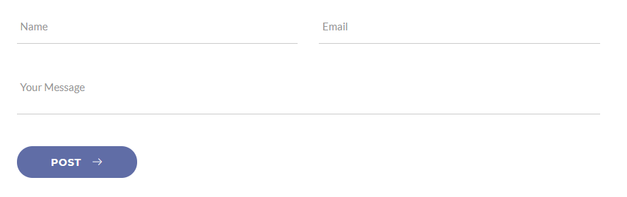
<section  id="contact" class="contact contact-1">
     <div class="container">
        <div class="row">
            <div class="col-12 col-sm-12 col-md-12 col-lg-8 col-md-offset-2">
                 <div class="contact-form">
                     <form method="post" action="assets/php/contact.php" class="contactForm mb-0">
                        <div class="row">
                            <div class="col-sm-12 col-md-6 col-lg-6">
                              <div class="form-group">
                                 <input type="text" class="form-control" id="name" placeholder="Name:">
                              </div>
                            </div>
                            <div class="col-sm-12 col-md-6 col-lg-6">
                              <div class="form-group">
                                 <input type="email" class="form-control" id="email" placeholder="Email:">
                              </div>
                            </div>
                            <div class="col-12 col-sm-12 col-md-12 col-lg-12">
                              <div class="form-group">
                                 <textarea class="form-control" id="message" rows="2" placeholder="Message" required></textarea>
                              </div>
                            </div>
                            <div class="col-12 col-sm-12 col-md-12 col-lg-12">
                                 <button type="submit" class="btn btn--primary btn--rounded">Post</button>
                            </div>
                        </div>
                    </form>
                </div>
              </div>
            </div>
         </div>
     </div>
 </div>
icon text
Screenshoot:
<section id="feature1" class="feature feature-1 text-center">
    <div class="container">
        <div class="row">
          <div class="row">
            <div class="col-12 col-sm-6 col-md-3 col-lg-3">
                <div class="feature-panel"<
                    <div class="feature--icon"><i class="icon-bolt"></i></div>
                    <div class="feature--content">
                        <h3>...</h3>
                    </div>
                </div>
            </div>
            <div class="col-12 col-sm-6 col-md-3 col-lg-3">
                <div class="feature-panel">
                    <div class="feature--icon"><i class="icon-location"></i></div>
                    <div class="feature--content">
                        <h3>...</h3>
                    </div>
                </div>
            </div>
            <div class="col-12 col-sm-6 col-md-3 col-lg-3">
                <div class="feature-panel">
                    <div class="feature--icon"><i class="icon-phone"></i></div>
                    <div class="feature--content">
                        <h3>...</h3>
                    </div>
                </div>
            </div>
            <div class="col-12 col-sm-6 col-md-3 col-lg-3">
                <div class="feature-panel">
                    <div class="feature--icon"><i class="icon-link"></i></div>
                    <div class="feature--content">
                        <h3>...</h3>
                    </div>
                </div>
            </div>
        </div>
    </div>
</section>
wrap any content inside feature
testimonials
You can choose between 6 testimonial section while you creating your pages. Simply adding section to your page. you can find all widgets in elements-testimonials.html.
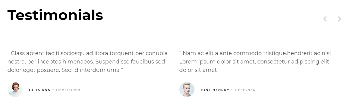
<section id="testimonial1" class="testimonial testimonial-1 text-center">
<div class="container">
    <div class="row">
         <div class="col-12 col-sm-12 col-md-12 col-lg-12">
            <div class="carousel owl-carousel" data-slide="2" data-slide-rs="1" data-autoplay="false" data-nav="false" data-dots="false" data-space="0" data-loop="true" data-speed="800">
                 <div class="testimonial-panel">
                    <div class="testimonial--body">
                        <p>...</p>
                    </div>
                    <div class="testimonial--meta">
                        <h4>...</h4>
                    </div>
                </div>
            </div>
         </div>
     </div>
  </div>
</section>
wrap any content inside testimonials
- testimonial-1
- testimonial-2
video button
Screenshoot: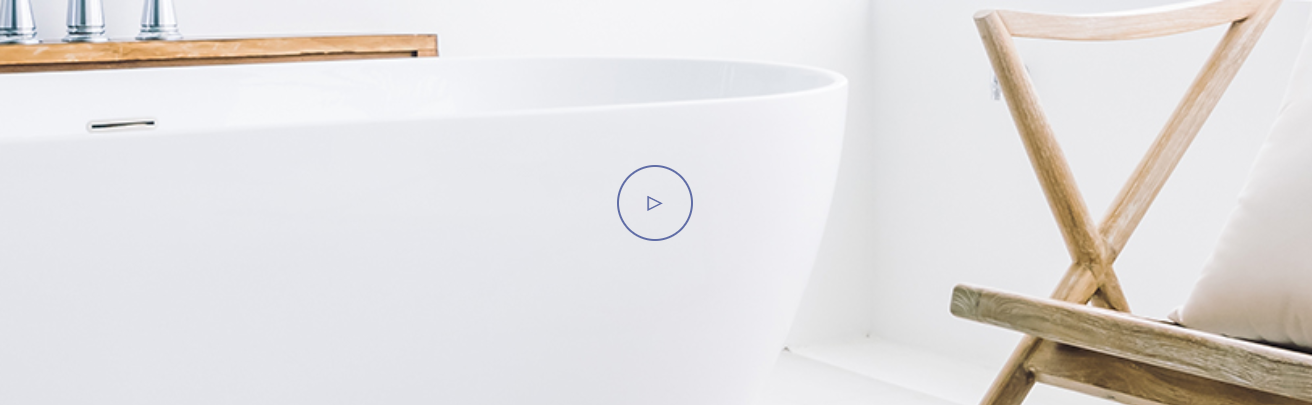
<section id="video" class="video-section pt-0 pb-0">
    <div class="container">
        <div class="row">
            <div class="col-12 col-sm-12 col-md-12 col-lg-12">
                <div class="video--content">
                <div class="video--button">
                <a class="popup-video" href="https://www.youtube.com/watch?v=nrJtHemSPW4">
                    <i class="fa fa-play"></i>
                </a>
                </div>
            </div>
        </div>
    </div>
</section>
the highlighted text with yellow color is the youtube video link you can change it
video button
Screenshoot: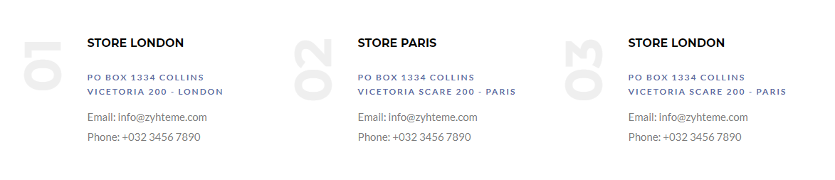
<div class="banner-panel">
    <div class="num">01</div>
    <div class="panel--content">
        <h5>...</h5>
        <p>....</p>
        <ul class="list-unstyled mb-0">
            <li><a href="#">...</a></li>
            <li><a href="#">...</a></li>
        </ul>
    </div>
</div>
header
Screenshoot:
<header id="navbar-spy" class="header header-5 header-transparent">
    <nav id="primary-menu" class="navbar navbar-expand-lg navbar-light">
        <div class="container">
            <a class="navbar-brand" href="index.php">
                <img class="logo" src="assets/images/logo/logo.png" alt="logo">
            </a>
            <button class="navbar-toggler" type="button" data-toggle="collapse" data-target="#navbarContent" aria-controls="navbarContent" aria-expanded="false" aria-label="Toggle navigation">
                <span class="navbar-toggler-icon"></span>
            </button>
            <div class="collapse navbar-collapse" id="navbarContent">
                <ul class="navbar-nav ml-auto">
                    ...
                </ul>
            </div>
        </div>
    </nav>
</header>
| class | Description | Code Example |
|---|---|---|
header-transparent |
Header with a Transparent Background. |
<header id="navbar-spy" class="header-transparent">
    ...
</header>
|
header-light |
Header with a white Background. |
<header id="navbar-spy" class="header-light">
    ...
</header>
|
header-bordered |
Header with a border from bottom. |
<header id="navbar-spy" class="header-bordered">
    ...
</header>
|
header-fixed |
make header fixed at the top |
<header id="navbar-spy" class="header-fixed">
    ...
</header>
|
header-white |
make menu item color white |
<header id="navbar-spy" class="header-centered">
    ...
</header>
|
Menu
<div class="collapse navbar-collapse" id="navbarContent">
    <ul class="navbar-nav ml-auto">
        <li><a href="#">...</a></li>
        <li><a href="#">...</a></li>
        <li><a href="#">...</a></li>
        <li><a href="#">...</a></li>
        <li><a href="#">...</a></li>
    </ul>
</div>
the highlighted text with yellow color is the page link you can replace it with page link
Mega Menu
<div class="collapse navbar-collapse" id="navbarContent">
    <ul class="navbar-nav ml-auto">
        <li  class="has-dropdown mega-dropdown active">
           <a href="#" data-toggle="dropdown" class="dropdown-toggle menu-item">...</a>
           <ul class="dropdown-menu mega-dropdown-menu">
               <li>
                   <div class="container">
                       <div class="row">
                           <div class="col-md-3">
                               <ul>
                                   <li><a href="#">...</a></li>
                                   <li><a href="#">...</a></li>
                                   <li><a href="#">...</a></li>
                               </ul>
                           </div>
                            <div class="col-md-3">
                               <ul>
                                   <li><a href="#">...</a></li>
                                   <li><a href="#">...</a></li>
                                   <li><a href="#">...</a></li>
                               </ul>
                           </div>
                           <div class="col-md-3">
                               <ul>
                                   <li><a href="#">...</a></li>
                                   <li><a href="#">...</a></li>
                                   <li><a href="#">...</a></li>
                               </ul>
                           </div>
                       </div>
                   </div>
               </li>
           </ul>
        </li>
        <li><a href="#">...</a></li>
        <li><a href="#">...</a></li>
        <li><a href="#">...</a></li>
        <li><a href="#">...</a></li>
    </ul>
</div>


<li class="has-dropdown mega-dropdown active">
    <a href="#" data-toggle="dropdown" class="dropdown-toggle menu-item">Home</a>
    <ul class="dropdown-menu mega-dropdown-menu">
        <li>
            <div class="container">
                <div class="row">
                    <div class="col-md-3">
                        <ul>
                            <li>
                                <a href="home-1.php">home 1</a>
                            </li>
                            <li>
                                <a href="home-2.php">home 2</a>
                            </li>
                            <li>
                                <a href="home-3.php">home 3</a>
                            </li>
                        </ul>
                    </div>
                    <div class="col-md-3">
                        <ul>
                            <li>
                                <a href="home-4.php">home 4</a>
                            </li>
                            <li>
                                <a href="home-5.php">home 5</a>
                            </li>
                            <li>
                                <a href="home-6.php">home 6</a>
                            </li>
                        </ul>
                    </div>
                </div>
            </div>
        </li>
    </ul>
</li>
footer
Screenshoot: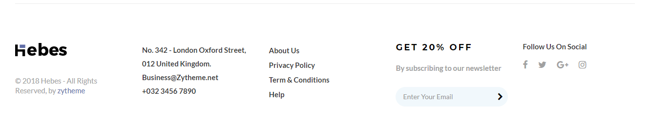
<footer id="footer" class="footer footer-2">
	<div class="footer-widget">
		<div class="container">
			<div class="row">
              <div class="col-sm-12 col-md-12 col-lg-5ths widget--logo text-center-xs">
					<div class="widget--content">
					    <div class="widget--logo-img">
                           <img src="..." alt="logo">
					    </div>
					</div>
				</div>
				<div class="col-sm-12 col-md-6 col-lg-5ths text-center-xs widget--contact-info">
					<div class="widget--content">
                        <ul class="list-unstyled mb-0 mb-30-xs clearfix">
                            <li>No. 342 - London Oxford Street,</li>
                            <li>012 United Kingdom.</li>
                            <li><a href="mailto:info@zytheme.net">info@zytheme.net<a><li>
                            <li><a href="tel:+03234567890">+032 3456 7890</a><li>
                          </ul>
					</div>
				</div>
                <div class="col-sm-12 col-md-6 col-lg-5ths text-center-xs widget--links">
                        <div class="widget--content">
                         <ul class="list-unstyled">
                            <li><a href="page-about-1.php">About Us </a></li>
                            <li><a href="page-privacy.php">Privacy Policy</a></li>
                            <li><a href="page-terms.php">Term & Conditions</a></li>
                            <li><a href="#">Help</a></li>
                        </ul>
                    </div>
				</div>
               <div class="col-sm-12 col-md-6 col-lg-5ths text-center-xs widget--newsletter">
                    <div class="widget--content">
                         <h3>GET 20% OFF</h3>
                         <p>By subscribing to our newsletter</p>
                         <form class="form--newsletter">
                            <input type="email" id="newsletterEmail" class="form-control" placeholder="Enter your email">
                            <button type="submit"><i class="fa fa-chevron-right"></i></button>
                            <div class="contact-result"></div>
                         </form>
                    </div>
                </div>
                <div class="col-sm-12 col-md-6 col-lg-5ths text-center-xs widget--newsletter">
                    <div class="widget--content">
                       <ul class="list-unstyled mb-0 clearfix">
                          <span>Follow Us On Social</span>
                           <a class="facebook" href="#"><i class="fa fa-facebook"></i></a>
                           <a class="twitter" href="#"><i class="fa fa-twitter"></i></a>
                           <a class="google-plus" href="#"><i class="fa fa-google-plus"></i></a>
                           <a class="instagram" href="#"><i class="fa fa-instagram"></i></a>
                       </ul>
                    </div>
				</div>
 			</div>
		</div>
	</div>
</footer>
shop
Screenshoot: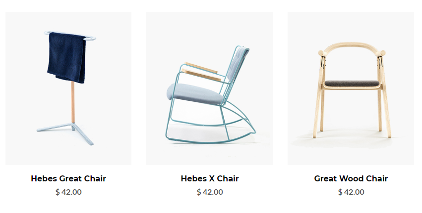
You can choose between shop grid options while creating your Pages. Simply select what you need form shop pages and work with it. Also we use isotrope to filter shop.
shop filter
shop item
<div class="categorey-item">
    <div class="categorey--img">
        <img src="your img path" alt="categorey" />
    </div>
    <div class="categorey--content">
        <div class="categorey--title">
            <h3><a href="#">...</a></h3>
        </div>
        <div class="categorey--price">
            <span>...</span>
        </div>
    </div>
    <div class="categorey--hover">
        <div class="categorey--action">
            <a href="page-cart.php" class="btn btn--primary btn--rounded"><i class="icon-bag"></i>ADD TO CART</a>
            <div class="categorey--action-content">
                <div class="categorey--action-icons">
                    <a data-toggle="modal" data-target="#product-popup"><i class="ti-search"></i></a>
                    <a href="#"><i class="ti-heart"></i></a>
                    <a href="#" class="compare" data-toggle="modal" data-target="#compare-popup"><i class="icon-shuffle"></i></a>
                </div>
                <div class="categorey--hover-info">
                    <div class="categorey--title">
                        <h3><a href="#">...</a></h3>
                    </div>
                    <div class="categorey--price">
                        <span>...</span>
                    </div>
                </div>
                <div class="categorey--colors">
                    <a href="#" class="color-1"></a<
                    <a href="#" class="color-2"></a<
                    <a href="#" class="color-3"></a<
                    <a href="#" class="color-4"></a<
                </div>
            </div>
        </div>
    </div>
</div>
shop types:
- list
- carousel
- masonry
- gallery
shop grid:
- 2 Columns
- 3 Columns
- 4 Columns
shop single types:
- full width
- right sidebar
- left sidebar
about
Screenshoot: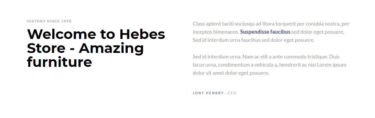
You can choose between shop grid options while creating your Pages. Simply select what you need form shop pages and work with it. Also we use isotrope to filter shop.
<section id="about1" class="about about-1 pt-100">
    <div class="container">
        <div class="row">
            <div class="col-sm-12 col-md-12 col-lg-6">
                <div class="heading heading-2">
                    <p class="heading--subtitle">...</p>
                    <h2 class="heading--title">...</h2>
                </div>
            </div>
            <div class="col-sm-12 col-md-12 col-lg-6">
                <div class="about--text">
                     <p>....</p>
                     <p>....</p>
                </div>
                <div class="about--signature">...</div>
            </div>
        </div>
    </div>
</section>
Blog
Screenshoot: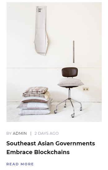
You can choose between blog grid pages while you creating your pages.
Posts use Simple code for post item. Use the Code below:
<div class="blog-entry">
    <div class="entry--content">
        <div class="entry--meta">
            <span class="meta--author"><a href="#">...</a></span>
            <span class="meta--time"> ...</span>
        </div>
        <div class="entry--title">
            <h4><a href="#">...</a> </h4>
        </div>
    </div>
    <div class="entry--img">
        <a href="blog-single-sidebar-left.php">
            <img src="img path" alt="entry image"/>
        </a>
    </div>
    <div class="entry--footer">
        <div class="entry--more">
            <a href="#"></a>
        </div>
    </div>
</div>
blog types:
- minimal
- classic
- masonry
blog grid:
- 1 Column
- 2 Column
- 3 Column
- 4 Column
post types:
- Standard
- Split
- Gallery
Credit Files
I've used the following images, icons or other files as listed.
JavaScript Plugins
- jQuery
- bootstrap
- gmap
- nicescroll
- ajaxchimp
- owl carousel
- isotope
- infinitescroll
- magnific-popup
- waypoints
- owl slider
- images loaded
- jflickr feed
- moment
- twitter Fetcher
CSS Files
Icons
Images
Support
If you need any help. Feel free to contact me anytime. I will reply in 24 hours. Send a mail from Themeforest Profile.
changelog
Initial Release V1.0
Released on Sep 4 2019.